
Mihai Mangiulea, Neverplaces 1, Untitled
photo-eye | Mihai Mangiulea, портфолио Neverplaces 1


Работы без названия
Chromogenic Print
16x24" Image
28x32" Mat
разные тиражи
$800
http://www.photoeye.com/
| Форум фотографов. https://forum.znyata.com/ |
|
Встреча с легендой.https://forum.znyata.com/viewtopic.php?f=12&t=2530 |
Страница 41 из 90 |
| Валерий Лобко [ 15 ноя, 07 12:26 ] | |
|
Mihai Mangiulea, Neverplaces 1, Untitled photo-eye | Mihai Mangiulea, портфолио Neverplaces 1
Работы без названия Chromogenic Print 16x24" Image 28x32" Mat разные тиражи $800 http://www.photoeye.com/ |
|
| Валерий Лобко [ 15 ноя, 07 12:49 ] | |

Mihai Mangiulea, Untitled, Chromogenic Print И вот такая еще подборка работ, предваряемая текстом: photo-eye | Mihai Mangiulea Shadow Line Introduction This series of photography is apparently about nature and landscapes but it is more about an image of sorrow and melancholy. And it is also about a frontier, an uncertain frontier, a play in space between appearance and virtuality. In comparison with other series, the process of the images composing Shadow Line is much more spontaneous. The colour or black & white slides are directly printed without other interventions on the images.  
 
Работы без наименований Chromogenic Print 16x24" Image 28x32" Mat разные тиражи $800 http://www.photoeye.com/ |
|
| Валерий Лобко [ 15 ноя, 07 20:38 ] | |

Keith Carter 19 работ в Howard Greenberg Gallery, New York 

http://www.howardgreenberg.com/ |
|
| Валерий Лобко [ 15 ноя, 07 21:16 ] | |
Keith Carter От Stephen L. Clark Gallery, ArtNet, четыре страницы, крупные изображения… 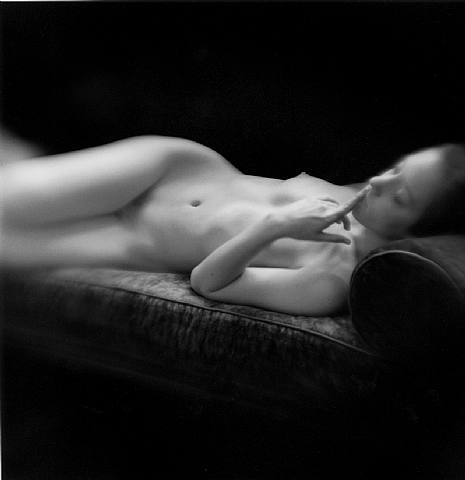
Keith Carter, Vermeer's Dream 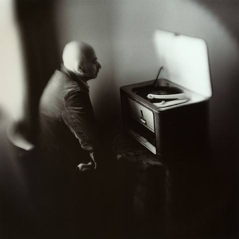
Keith Carter, Phonograph 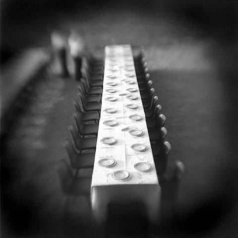
Keith Carter, Thirty Plates (пардон, если повторяюсь…) Первая страница портфолио |
|
| Валерий Лобко [ 15 ноя, 07 21:25 ] | |
Photographs Do Not Bend Gallery Keith Carter 
Night Clerk 
Elephant Keeper 
Mezzanine 
Homage to Sudek http://www.pdnbgallery.com/artists/newkcweb/ |
|
| Валерий Лобко [ 15 ноя, 07 21:58 ] | |
Keith Carter 
Keith Carter, Hallway, 2003 toned gelatin silver print, 15 x 15 inches, edition of 35, $1,000.-$3,500. Интересная и крупная подборка работ в G. Gibson Gallery. Представлены и работы с достаточно ранней датой:  
Keith Carter, Chicken Feathers, 1992 toned gelatin silver print, 15 x 15 inches, sold out edition of 50 Keith Carter, Equestrienne, 1997 Новая и не очень известные работы:  
Keith Carter, White Dress, 2004 Keith Carter, White Deer, 2004  
Keith Carter, Under Saturn, 2007 Keith Carter, Inner Tube, 2005  
Keith Carter, Acrobatics, 2005 Keith Carter, Hillside, 2005 Страница 1 портфолио |
|
| Ведренко Валерий [ 15 ноя, 07 22:00 ] | |
Валерий Лобко писал(а): Ага, Франция.
Как я понимаю, плакат демонстрирует лучшее из лучшего…........ Какими же результатами должен похвастаться фотокружок при Доме культуры деревни Сердюки.... И снова тишина... Выставка белорусской фотографии в Париже, а в обществе белорусских фотографов о ней понятия не имеют… Что же это за общество… И снова – все как-то само собой... А здесь такие серьезные дяди так конструктивно топят друг друга... А другие дяди в это время.... Все… Обрыдло |
|
| Валерий Лобко [ 15 ноя, 07 22:47 ] | |
Валерий, вы знаете, мне уже даже становится смешно… Так мы туристам с камерами скоро начнем предъявлять претензии… Я уже говорил на соседних ветках, что выставка, обставленная как представительная белорусская, с кураторами/искуствоведом во главе и в участниках, даже если речь идет о почти фотоклубном обмене (и если бы так), вполне подставляется под критику, особенно если учесть, что реальные результаты весьма плачевны. Уже в варианте «Второй волны» я выступал в качестве консультанта (максимум) на уровне подготовки топологии экспозиции главным образом. И было бы весьма странно — при инициативе самих выпускников и при наличном организаторе выставке претендовать на что-то большее. Это абсолютно нормально, когда начинающие фотографы сами проявляют инициативу; кроме того, речь идет о целевой выставке фотографий, где разный взгляд и информационная составляющая куда более важны с точки зрения организаторов, чем креативная претензия. В конце концов, это не «За Беларусь» и «Не против». Я держу подборки работ многих студийцев… в принципе, если посмотреть на оценку «Второй волны», то она в корне неверна — в ТМ не ставили задачу выпускать ударные группы креативных фотографов… Это, насколько я осведомлен, ожидает нас уже с первыми выпусками специализации «Фотография и дизайн» БГАИ — вот там и разбирайтесь, подождите до выпускных дипломов только. Поэтому претензия к тем же гламурным работам на выставке должна была не в по факту отсутствия у автора проникновенных портретов в глубокой черной или отчаянно белой тональности, а по техническим и иным особенностям жанра — человек за этим пришел в студию, на входе был вот такой, а вот здесь у него появился вот такой результат. Что не так? Работа со светом не такая? Позы не те? Плотности не те заданы? Покажите, где и что не так — конкретно. Мы этому учили, да и то, не всех — со студийным светом работала относительно небольшая группа слушателей, часть из которых учится до сих пор. А говорить, что выпускники учебной студии не ту фотографию делают и не то показали — просто смешно — они получили, кто как мог взять, технический инструмент и увидели доминанты фотографии, вещи, которые нравятся В. Терентьеву, А. Ильину, которые предпочитаю я — ограниченно и факультативно. Задачей студии не было ни развивать скоро и с быстрым ожидаемым результатом видение, креативное мышление, ни даже работу с камерой вслепую — многие, придя в студию, были совсем новичками. Это, по сути, базовый технический уровень — эксперименты с продвинутым только начинались, когда мы ушли. Вот так. Можно сказать, что и выставляться не стоило, так это можно сказать и по поводу массы работ на «ФотоФоруме», где претензия, насколько я понимаю, была самая что ни на есть креативная… Что касается парижской инициативы — они сами это сделали, и на здоровье. Каким-то фактом фотографической жизни это не может стать по определению, но это безумно важный этап взросления наших выпускников и их коллег в этом проекте, работа с реальным результатом, и я рад за них. Это не любительские состязания, не работа даже на приступах к арт-рынку, не выставка мира и дружбы в фотографии, нет… Этот проект объявлялся, в нем можно было принять участие, было авторское предложение, какой-то отбор. Хотите критиковать — отлично. Выясните только вначале, зачем, почему, какой был отбор, посмотрите, как выглядят снимки в оригинале хотя бы, пусть и не в реальном интерьере… я думаю, что и авторы, и Алена будут вам весьма благодарны за отзыв, пусть и самый уничтожающий — была бы аргументация. В общем, как уже говорили, любая выставка заслуживает разговора, жаль как раз того, что редко видишь результат хотя бы в виде обсуждения. Если результатом будет продолжение контактов (а речь идет о галерее), то это — уже успех. Насколько мог быть другим набор фотографий — тоже вопрос. Рассылка является публичной… кто хотел и мог принять участие, тот отозвался, таких принципиальных ограничений — только выпускники ТМ — не было. Я Алену знаю еще по университету, девушка вменяемая и толковая… Был рад, что она пришла в ТМ, был очень рад увидеть ее этим летом… Кажется, при всех проблемах «Творческие мастерские» в одном очень преуспели — нам приятно видеть друг друга, а связи, которые возникли во время обучения, не исчезли с моментом выпуска слушателей… А что касается творчества — кому суждено, тот проявится, в том числе и через такие вот первые шаги. |
|
| Валерий Лобко [ 16 ноя, 07 10:56 ] | |
Mac Edition Radio Вот еще, почти в тему: Photography Consultant Mary Virginia Swanson On The Portfolio Review Process and More From One of the Most Respected Voices In The Photo Community — Photo Lucida Conference, Portland, Oregon 2007 Mary Virginia Swanson is one of the most respected and sought after voices in the photographic community, bringing a wide-range of experiences ranging from museum, editorial, fine-art, and more coupled with a committed passion for education and the expansion of the photographic aesthetic. In this extended conversation we discuss the rise of portfolio reviews, the status of photographic book publishing, and her own career in photography. If you are serious about your photography, then listen in as Mary Virginia Swanson elucidates her view of contemporary photography, marketing your work, and how to succeed in meeting the goals you set for your photography or art career. Recorded at the Photo Lucida Conference in Portland, Oregon in April 2007 by Harris Fogel. http://maceditionradio.com/index.php?mo ... =3&pid=127 For information on the Photo Lucida Conference visit: www.photolucida.org http://mvswanson.com/lectures_wksh/lectures_wkshp.php Интересный блог у нее: Marketing Photos with Mary Virginia Swanson: http://marketingphotos.wordpress.com/ (Призы, гранты, лекции, фестивали, конкурсы…) К примеру: Fotofest International Discoveries: A Selection of Contemporary Artists from Around the World Each year FotoFest creative directors visit festivals in France, Poland, Bratislava, Brazil, Portland and elsewhere around the world to meet artists and look at work. The International Discoveries exhibition is the product of these travels. Founders Wendy Watriss and Fred Baldwin, along with Exhibitions Coordinator Jennifer Ward chose nine artists for the exhibition, representing some of the best work they have encountered in their travels to Europe, South America and the United States. The exhibition artists are Chan-Hyo Bae (South Korea), John Chervinsky (U.S.), Kelly Flynn (U.S.), Roberto Fernández Ibáñez (Uruguay), Jesús Jiménez (Mexico/London), Lydia Panas (U.S.), Przemyslaw Pokrycki (Poland), Diego Ranea (Argentina), and Alessandra Sanguinetti (Argentina). Еще ссылочка про запас: society for photographic education: http://www.spenational.org/ Fine Print Collector's Program : http://www.spenational.org/portfolio/index.html The artists represented in our Fine Print Collector's Programs have generously donated their creative work in order to support SPE and its programming. As a benefit to our members, the prints included in the portfolio are offered at a fraction of current gallery prices with the intent of making them accessible to a broad collectorship. ... Похоже, интересный вариант сотрудничества про запас можно иметь в виду: сервисы печати выделяют интересные работы, на основе которых можно подготовить выставку, или сами, согласуя с авторами, готовят подборку, где выделяют наградную работу или несколько. Сетевая версия, естественно, с призом зрительских симпатий… |
|
| Валерий Лобко [ 16 ноя, 07 15:37 ] | |
Долго колебался, давать ли ссылку… Потом решил, что можно вот отсюда начать, с The Book Beat Cavern: 
Jeffrey Silverthorne: Directions for Leaving, Photographs 1971-2006 (signed exhibition catalog) Author/Artist: Annie Proulx/ Jeffrey Silverthorne Publisher: Fotografisk Center A recent retrospective catalog published by Fotografisk Center in Denmark on the occasion of the Silverthorne exhibition summer of 2007, essay by Pulitzer Prize winning author Annie Proulx, interview with Cary Loren and a letter by Robert Frank. About 200 pages, color and black and white full page images, covering all aspects of the photographer's work including; female impersonators, morgue work, missing person posters, Texas-Mexico border, portraits, nudes, silent fire series, Detroit Negatives, Goth kids and recent work featuring self-portraiture and nude models. Fascinating nerve-wrenching work. Imagine a meeting of Kafka, Freud and Brassai in a Mexican bordello during their last days on earth. Catalog is hardbound, in decorative boards, 9x7", only 1200 copies were printed. This copy is signed by the photographer. About the Artist: Jeffrey Silverthorne is an MFA graduate of Rhode Island School of Design and has studied with Harry Callahan and Aaron Siskind. His first major project was an investigation into the daily practices of the morgue, which began after Silverthorne's discussion and meeting with Diane Arbus as a guest lecturer at RISD in the late 1960s. The morgue work was first shown in 1973 at the Witkin gallery in NYC. Silverthorne has work in the collections of MOMA, the National Gallery of Art and the Museum of New Orleans. Silverthorne has taken on various self-motivated projects that explore existence on the very fringes of society, some of these areas include; prisons, prostitutes, transvestites, slaughter-houses, the circus, Goth clubs, morgues and more recently his own body in relationship to a field of nude models and casual studio and backyard settings. Many of his images echo classical formal studies, with traces of Max Beckman, Soutine, Rembrandt and Gericault. His studio work has a casual elegance set against the performance of everyday rituals under the specter and dimension of sexual desire and the acceptance of aging. "The new work has been about attraction, desire, basic elements of life... a kind of contained theater," Silverthorne has said. http://www.thebookbeat.com/shop/product ... s_id=23336 Там же: раздел «История и критика»: http://www.thebookbeat.com/shop/index.php?cPath=1_6_362 В частности: 
Regarding the Pain of Others Author/Artist: Susan Sontag Publisher: Farrar, Strauss & Giroux Twenty-five years after her classic On Photography, Susan Sontag returns to the subject of visual representations of war and violence in our culture today. How does the spectacle of the sufferings of others (via television or newsprint) affect us? Are viewers inured--or incited--to violence by the depiction of cruelty? In Regarding the Pain of Others, Susan Sontag takes a fresh look at the representation of atrocity--from Goya's The Disasters of War to photographs of the American Civil War, lynchings of blacks in the South, and the Nazi death camps, to contemporary horrific images of Bosnia, Sierra Leone, Rwanda, Israel and Palestine, and New York City on September 11, 2001. http://www.thebookbeat.com/shop/product ... s_id=22569 About Looking, $13.00 : http://www.thebookbeat.com/shop/product ... s_id=22716 |
|
| Валерий Лобко [ 16 ноя, 07 15:47 ] | |

Fish & Pear, 1996 20 x 16 in. painted gelatin silver Jeffrey Silverthorne  
 
Orpheus, Silent Fire series, 1983 Orpheus, Silent Fire series,1982 17 1/4 x 11 1/2 in. gelatin silver Lovers, Silent Fire series,1983 The Wedding Feast, Silent Fire series, 1983 17 1/4 x 11 1/2 in. gelatin silver Prices range from $800-$5000. http://www.photographsdonotbend.com/artists/silverthorne.html |
|
| Валерий Лобко [ 16 ноя, 07 19:25 ] | |
Ну, чуть Saul'а Zanolari для контраста: 
Блог: http://saulzanolari.blogspot.com/ (где масса ссылок) Сайт: http://saulzanolari.com/ 
Еще вот тут картинку положил из Eyemazing: http://forum.znyata.com/viewtopic.php?p=18956#18956 * Вот так оно на выставках: 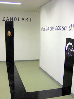
Inga-Pin Contemporary / 26.04.2007 - 02.06.2007 SAUL ZANOLARI на artshole.co.uk 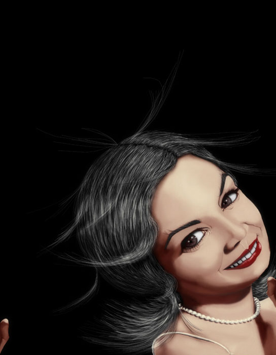
Connie Francis, 2006, 90x70 cm, Lambda Print, 5 copies http://www.artshole.co.uk/saulzanolari.htm Saul Zanolari 
Saul Zanolari, Lambda Print mounted on aluminium, Edition of 5, Dirty Mario Diaz http://www.thebricklanegallery.com/Saul_Zanolari.htm Текст из Eyemazing: http://www.eyemazing.com/ Raquel Welch, in all of her languorous glory, lounges in a field of grass. Audrey Hepburn flashes a coquettish grin while laying her dainty head on a white pillow. Zsa Zsa Gabor tilts a curious look at the camera. These are Saul Zanolari’s divas: flirty, gorgeous caricatures of Western femininity. With his singular method of transforming original photographs into wildly exaggerated cartoon-like representations, Zanolari simultaneously celebrates Western divas and gently examines their role as the pinnacle of glamour. Zanolari’s hyper-detailed depictions of celebrity push the definition of photography. Using already existing photos, Zanolari draws and retouches every pixel of the original, creating a final image that both attracts and repels in its hyperbole. The viewer is left asking: is this an illustration? A photo? A digital drawing? Or some whole other beast? In fact, because Zanolari is working in such a detailed manner with every pixel of the photograph, his method is quite like traditional drawing, but with the final outcome being something entirely new. It calls into question what we can consider photography. He comments, “It would be easier to take a piece of paper or a canvas and start drawing with pencils and acrylic colours, or if I want a photo just to take the camera and shoot! But I prefer what I do. I’m really proud of the results. I like to mix the best of different techniques (photography and drawing) and to surprise the audience. From drawing, I love the ‘made by hand’ methods (that's basic for me) and freedom. From photography, I like the sharpness, gloss, and the easy way to reproduce copies of the work.” The young, Swiss-born photographer, who also has a background in painting and engraving, has been creating these detailed caricatures – both heinous and beautiful – of friends, family and celebrities for many years. This current series, however, Twilight of the Goddess, takes his work into a cross-cultural study of relationships between the East and the West and our personification of celebrity. Zanolari is producing this series for the F2 gallery in Beijing, a gallery that has shown the work of everyone from Basquiat to Mapplethorpe, and whose purpose is to “contribute to the cross-cultural exchange of blue chip and cutting edge contemporary art between China and the West.” … Zanolari says that he is playing with paradox and opposites in his photography. “Mine is an intimate search,” he says. “I try to describe an existential condition made of paradoxes and conventions. In my art, the positions are both found, the opposite ones meet and cohabit.” In his images, you will find extreme beauty melding with terrific ugliness, a confusing movement counterbalanced by a steady base, colour saturation met with the absence of colour, a blur edged by clarity. This marriage of opposites sweeps Zanolari’s images off of the page and into our imaginations. Text by Clayton Maxwell |
|
| Валерий Лобко [ 16 ноя, 07 23:05 ] | |
Миленькое такое мероприятие провели: Fashion Stories Fashion Photography exhibition, in association with the London Design Festival, 2006 
Fashion Stories Private View at The Brick Lane Gallery Tina Tahir 
Tina Tahir, FLORAL, Giclee Prints, edition 3/5 Micky Modo   
Micky Modo, Design by Spire "Marchesa Casati", UV pigment-base print on old mirror, Cabaret" frame, orig.French, gold 22/23K (1840-1860 ca.) "Tina", UV pigment-base print on natural-aged wood "Elizabeth", UV pigment-base print on silver-rust wallpaper and wood frame Stuart Weston  
Stuart Weston, Lambda Prints, A0 Oleg Micheyev 
 
Private View Images... http://www.thebricklanegallery.com/Fashion_Stories_Private_View.htm http://www.thebricklanegallery.com/Fashion_Stories.htm |
|
| Валерий Лобко [ 17 ноя, 07 0:33 ] | |
О! У них имеется свой Саша Пасканной ( http://www.infrance.ru/forum/showthread.php?t=33859 )! Антон СОЛОМУХА : Нічний Париж ( http://www.kut.org.ua/art_a0037.php ) * Но я, в общем, скорее вот про это ( http://www.kut.org.ua/art_a0066.php ) : Дзеркало жінки (Miroire de Femme), Антон СОЛОМУХА (Anton SOLOMOUKHA) «Ідея цього фотоциклу — модель та її віддзеркалення, її роздвоювання створює подвійне зспоглядання: по обидва боки дзеркала. Фотограф зі своїм об'єктивом дивиться на подвійну мізансцену та дублює її. Але це все не ще: глядач дивиться на модель, яка дивиться на своє відображення, яке дивиться на модель, на які дивиться фотограф з об'єктивом свого фотоапарату...» * Или, если точнее, то вот про это: http://www.art-gu.ru/gallery/a_list.pht ... Solomoukha Или, если полнее, то вот это: http://www.artmajeur.com/?login=solomou ... _galleries Собственно, это все в связи с тем, что в новом Eyemazing — большая статья ( http://www.eyemazing.com/ ) : Anton Solomoukha Little Red Riding Hood Visits the Louvre If he were a character in a fairy tale, he would probably be called the “Cheery Eccentric”. Anton Solomoukha might indeed enjoy that. Fairy tales — Little Red Riding Hood amongst others — fascinate this voluble painter-turned-photographer whose work breathes irony and erotic fantasy. Born in Kiev, in Soviet-controlled Ukraine, Solomoukha boasts of never having suffered under Communism. In 1978, at the age of 29, he nevertheless seized an opportunity to emigrate, arriving in Paris at a time when it was “absolutely impossible” he says, to leave the USSR. How did he do it? Easy. “I married a woman who was doing a doctorate in musicology in Kiev. Her mother was from Guadalupe. I told the Soviet authorities I wanted to go to France to study the plight of workers from Guadalupe. Thanks to my wife’s French nationality, the Soviets gave me permission to leave for a month, and I never went back.” At the Parisian gallery that represents him, Solomoukha continues to spin effusive yarns for me about his youth in Kiev and his photography career in France. “I find it fascinating to talk about myself!” he exclaims, bursting into laughter. Barbara Oudiz (BO): Life for you as a student and an artist in Communist Ukraine was not particularly difficult, you say. Isn’t that surprising? Anton Solomoukha (AS): My father was an official in the education department of the government. That’s why I always had very good relations with big wigs in the Soviet regime. As a result, I never had the slightest problem in the USSR. All I had to do was phone the police! This was in the days of Khrushchev, when there was a certain degree of openness, and so my father didn’t work in a repressive structure. On the contrary! ... BO: And after your military service, you entered art school in Kiev. AS: I studied at the best Fine Arts school in Ukraine with a fabulous professor who was very well known at the time, Tatiana Yablonskaia. I studied there from age 21 to 27, and did two doctorates. It was a very positive experience for me, even though the courses were very classic and demanding. The level was very high and the selection process was extreme. Each year they weeded out dozens of students. Seven or eight hours a day were devoted to drawing, five or six hours to painting, and in the evenings we studied Marx. Or rather Marxist-Leninism. BO: The Socialist Realism ideal was still in full swing then. How did that affect you? AS: Socialist Realism was actually very good for us artists! We could earn money by making official art! Each exhibition contributed to the Revolution, to industry, to the Kolkhoz, or to some other official cause and so our work was bought by the state (laughs). We were the elite! BO: And you became a successful painter in Kiev? AS: I have pursued an artistic career all my life. There were moments of great success. I won many second prizes in painting and drawing competitions. I always came in second, though. And I know why. It’s because a gallery didn’t represent me in those days. I was independent, so I always got the jury’s prize, but never first prize. BO: How did you get involved in photography? AS: I’ve only been doing photography seriously for about fours years. While my daughter was at art school, she used to criticize me and say that I spent all day with my paintbrushes and never looked around me, never noticed what was going on in the outside world. It was a joke between us, but one day I took it to heart and made a decision: everything I hated most, I would study! And since I hated photography, I decided to take it up. At first I did it especially to flirt with women. I’d make portraits of women to get to know them. I used to save the images to use later for my painting. Then the Director of the Russian Photography House — which is like the Maison Européenne de la Photo in Paris — came to my studio one evening. She looked at the dozens of slides I had taken and told me: you have to become a photographer! So I started forging my path. Over the past four years, I’ve been in at least 70 group or solo exhibitions. That’s almost an exhibition every month. For a gallery owner, representing a painter is like marriage. Whereas the relationship between a gallery owner and a photographer is like adultery. It’s just a fleeting affair, a much “lighter” relationship. BO: Tell us about the genesis of the Little Red Riding Hood Visits the Louvre project. AS: I was seeking a way of bringing together something very contemporary with something very classic. Popular fairy tales, like those by Perrault and Grimm, actually castrated fairy tales, they emptied them of meaning. They made them very moralising and Christian. Perrault says basically that if Little Red Riding Hood had listened to her parents, she wouldn’t have gotten into trouble. But she had listened to her parents! She was not at fault! No one was at fault here! There is no moral issue in these tales! That’s what’s so powerful about them. BO: What is this fairy tale all about, then? AS: That’s is a good question. What is moral? What is good and bad? What is religion? What makes a girl become a woman? What makes a girl have her first period? Little Red Riding Hood was a little girl with her first period. That’s what Freud says. It is her sexuality that is emerging. And all the dangers that come with sexuality. The wolf, according to some interpretations, is the lover, according to others, the father. Why does the grandmother die? Because a woman is born, i.e. Little Red Riding Hood, and an old woman dies. The wolf, the lover, replaces the grandmother. BO: And the visit to the Louvre? AS: For me, the spirit of Little Red Riding Hood is like that of a newborn, or like the mind of a child. It is a new and feminine spirit. It is “mature” innocence. Why did I want her to visit the Louvre? I want her to confront life through art. I believe that the concentration of life can be found in art. I’ve understood more about history by looking at paintings than by reading books! This Little Red Riding Hood goes to the Louvre and looks at the paintings, and because she’s still a child, she imagines herself as the Infante Margarita in Las Meninas by Valasquez or as Suzanne in portraits by Rubens. BO: More often than not, you pose in these staged series. AS: Yes, but this is not out of narcissism. Although I see narcissism as a very positive thing! It’s the beginning of Christianity. Jesus’ most important rule is “Love your neighbour as you love yourself”. I love myself a lot, luckily! Good thing, because if you don’t love yourself, you’ll never make it… It’s often more out of convenience that I pose. Sometimes I just don’t find the right model. Or I replace a model in a photo when a shoot didn’t work out as expected. BO: In your earlier series, such as Lolita, the Mechanical Doll, there was only you and your model. Why? AS: The relationship between a photographer and his model is something very intimate. Lolita was a very interesting, very intimate project. Tatania, the model, was 18 years old when her mother brought her to me to be photographed. People see something erotic about the series, yet Tatania is never nude in these images. The idea was to construct images in relation to literature. A man, an artist, finds a sort of big damaged doll, and he repairs it. She becomes his wife and then she leaves him. It is in fact the opposite of Nabakov’s book. I worked with another woman named Irma in The Sex of Angels and the I Fuck your TV series, which was the first series I ever showed. They were all bought by people working in TV. I put Irma on all fours on a table in front of me, and instead of watching TV, I watched her backside. I got lots of letters about that series. BO: And you say don’t see your work as erotic fantasy? AS: I am not the right person to speak about eroticism. I see my work as being glacial, very cold and cerebral. All my models are so covered with powder and talc that they become like marble. You wouldn’t know it, but they are actually very made up. I study their bodies enormously. I spend the first three or four sessions just analysing the body and the effects light has on the body. This is a necessary step for me, and it kills all sexual desire. The relationship with my model becomes rather perverse in fact, because she shows me everything, and I become practically absent. I’m behind the camera. The only relationship between us is in the eye. I become a tyrant. I draw and use Photoshop to imagine the staging of the scene. I create the scene first in Photoshop using bits of existing paintings, so that I can imagine the scene before shooting it. I scream! And my models laugh! I am extremely demanding and meticulous! ... BO: Getting back to the Little Red Riding Hood series, I believe it is scheduled to become a book? AS: Yes, it should be published this year. It’s a project that consists of grouping some of my paintings and drawings, and lots and lots of my photographic portraits of various people dressed up as Little Red Riding Hood in scenes evoking paintings. I already have some 1,200 photos of models between 7 and 65 years old. Approximately 150 to 200 different people have posed for me so far. I keep the costumes handy in my studio and bring them with me when I travel. So I photograph people in the role wherever I happen to be. Some very well-known people have posed for these scenes, such as Thierry Fremont, CharlElie Couture, Pierre Cornet de Saint Cyr, Malaury Nataf, Louis Rego, and Baudoin Jannink. BO: How do you find these people? AS: I always find them the same way. When I look at someone, I know in which painting at the Louvre I’ve already seen him or her. I find that the history of art is a condensed version of the history of humanity. Nietzsche once said, “In answer to a question about what purpose art serves, that art allows us not to die from the truth of life.” In German it must sound much more elegant. I hate life that doesn’t reflect art in some way! BO: This book will be a way of expressing your life through art? AS: It will be an album that reflects my vision of what an image is. It will show how I think. When I take a picture, it is to remind people of a work of art in the Louvre rather than anything that they have already seen. I prefer my photographs to resemble famous works of art rather than the cover of Elle, for example. We can’t compete with advertising images! I do something completely different, something totally personal. This project has been slowly gestating for the past four years; I’ve been working on it seriously for about a year now. The book will include roughly ten articles and 300 visual documents – I might add, for example, a small picture of a sculpture by Rodin that will show the position of a body that interests me. I don’t need an editor for this book. It will probably be published in a limited series of 300 copies thanks to my sponsors – people in the financial world, bankers, etc. These people love my work and buy my photographs. This has allowed me to publish other books too, under the label, AS Editprod. My next book might also be under this label. But I’m not worried. Every time I meet a prospective publisher, he asks me: “Who takes the pictures?” Me, I say. “Who pays to get the book published?” Me. “Who writes the texts?” My friends. “What do I have to do?” Just put your name on it. And they say ok (laughs)! BO: What new projects are in the works? AS: There are lots and lots. I would like to do a story about the relationship between the body and food. I’d also like to re-do all the advertising photos that exist and make them resemble works by Rembrandt for example, to ridicule them. I don’t know which idea will emerge yet. Text by Barbara Oudiz http://www.solomoukha.com Gallery: Galerie 208 Patricia Chicheportiche, Paris www.galerie208.com 
Exhibitions: October 25-November 26, 2007 Art 208 Gallery, Paris Anton Solomoukha Le Petit Chaperon Rouge visite le Louvre Paris Photo 2007 |
|
| Валерий Лобко [ 17 ноя, 07 12:18 ] | |
Вот. После поверхностного знакомства с глубокими идеями и высоким фотографическим мастерством пришлось пройти терапию гидрохиноновыми притираниями. Помогло. 
JOSEPH MILLS, UNTITLED, INNER CITY #1390 Varnished silver gelatin print on expired photo paper, 1988 14" x 11 1/8" INNER CITY by Joseph Mills "Mills is a good enough picture maker to intrigue us and yet he is determined to keep us on the edge of unknowing." — Anne Tucker Joseph Mills is a mid-career artist who has produced three distinct but interlocking bodies of work. He is best known for his surreal photomontages and collages. The other two series are the ongoing affair, through photography, with his wife; and his black and white street work, the latter of which are featured in his first monograph, Inner City. People and their detritus are the focal points of these pictures. His subjects are not Washington’s elite, but those whose situations in life are more peripheral and vulnerable: children, street prophets, the homeless and the mentally unstable. The resulting pictures are both about the inner city life he records and his own internal conflicts. Printed on outdated paper and heavily coated in amber toned varnish, Mills’ photographs become objects, "windows onto some world that really wasn’t out there." Published in association with Hemphill, Washington, DC. Essay by Anne Tucker. 
Hardcover, 7 1/2 x 9 1/2, 72 pages, 49 four-color plates. ISBN 1-59005-055-x http://www.nazraeli.com/nazraeli/photomon/055-x.html Еще, по поводу выставки в Cohen Amador Gallery in New York City: «Though temporally distant from the Surrealist movement of the first half of the twentieth century, Mills’ work stems from a similar fascination with chance, subjectivity and the subconscious. In true surrealist style, Mills’ street photography transforms the seemingly quotidian into a dreamscape of life’s minutiae. Unlike the somewhat ethnographic approach of many surrealist photographers, Mills’ does not distance himself from this world, but rather involves himself deeply in its mysterious and wonderful insanity. A masticated piece of gum stuck on the end of a woman’s curled index finger, the ferociously long nails of a woman passing on the street, these become the elements of a familiar, yet mysterious, dreamscape. Often photographing from oblique angles, holding the camera low by his hip, and without the assistance of the viewfinder, Mills plays with chance, limiting his control of the image, and dispelling the general notion of the photographer as omniscient spectator by situating himself in league with the viewer, as the end result is not entirely known even to him. Mills heightens the impact of his surreal world by printing this series on expired photo paper giving the finished print an almost otherworldly glow. Because of this final chance procedure, each print is different and unique and a further testament to Mills’ own subservience to the process." http://gmtplus9.blogspot.com/2007_03_01_archive.html Cohen Amador Gallery Joseph Mills, INNER CITY 
JOSEPH MILLS, UNTITLED, INNER CITY #1398 Varnished silver gelatin print on expired photo paper, 1988 14" x 11 1/8" Joseph Mills, SHAKESPEARE PORTFOLIO 
JOSEPH MILLS, UNTITLED, SHAKESPEARE PORTFOLIO Varnished photomontage mounted on found book page and wood, 1987/2000 16" x 12" 
JOSEPH MILLS, UNTITLED, SHAKESPEARE PORTFOLIO Varnished photomontage mounted on found book page and wood, 1987/2000 16" x 12" http://cohenamador.com/Joseph_Mills.html |
|
| Валерий Лобко [ 17 ноя, 07 13:29 ] | |
http://www.eyemazing.com/ 
Joe Mills Through collage and photomontage, Joe Mills throws open the doors of his imagination and invites the viewer inside. Anne Tucker, Photography Curator at the Museum of Fine Arts in Houston, says of Mills, “He manages to transfigure reality, to hold in his collages enough of what we recognise, and transform it into a reality that is out of control, in a way that is both horrible and beautiful.” Using Life Magazine images, he assembles collages, photographs them, and then coats the final image in varnish. Here we talk with Mills about his schizophrenic break, harmony, and his passion for varnish. Clayton Maxwell (CM): You have been making collages from pieces of Life Magazine images since 1970. You have said that the book, Road to the Absolute, a study of surrealism by Anna A Balakian, pulled you out of a Kafka-esque nihilism into a more positive and productive mindset. You were also an ardent fan of surrealist André Breton. Nonetheless, you say that you are not a surrealist. Why not? How would you categorise yourself, if at all? Joe Mills (JM): Before I had come upon the Road to the Absolute in high school, I was steeped in Kafka, reading all of his works. I came upon his book, The Terror of Art. I was naïve at that point; I just knew I was interested in art, but hardly knew what that word meant, but this was the first book I took off the shelf about art. I saw this first paragraph of The Metamorphosis about Gregor Samsa turning into a beetle; it seemed strange to me – this fantastic realism. Kafka functions on so many levels, like this personal psychology that becomes expressed in a nightmare fashion; that became the root of much of what was to come later for me. When you think of Kafka, though, you don’t think of surrealism. … CM: So why don’t you consider yourself a surrealist? JM: I am more of a realist in that I’m not a nihilist, which was almost something you had to be in the band of brothers that Breton put together, with Ernst. They were very atheist in a religious sense, but they were using the methods of surrealism to let them deal with the marvellous and the infinite so as not to be wallowing in the despair of nihilism. But they still operated within that atheistic mindset. I’m not. That’s where I depart. I’ve found those methods to be the opposite in that they’ve brought me a way to touch creativity that was outside myself, that just wasn’t my own. It is a strong religious, spiritual experience for me. It’s something outside of myself that comes through. That’s the most reaffirming and positive experience I have. I don’t know what that makes me. I don’t have a clue. CM: You had a severe psychotic breakdown when you were 21, when you lost all hold on rational thought, deemed yourself a government agent, and were hospitalised for six months. You had a long hard recovery afterwards. You said that that period helped you discover “the harmony in things, a harmony that underpins all that is around us.” How do you reconcile that harmony with your collages, many of which are nightmarish and discordant if not violent? JM: Over the 40-something years that I’ve been working and thinking of aesthetics, I’ve come to the understanding that in terms of form and content, form is the greater aspect of a work of art. The older I get the more that seems to be. To me, the content and subject matter isn’t very important. It’s as if you have a radio – when those formal elements are not arranged right, whatever the content of that radio broadcast, you just don’t hear it. Sometimes it’s just a big white noise, garbled. But when you get it tuned right, you get the formal arrangement right, it opens this window, so that things come through with clarity. Again, I’m speaking about something outside of me, not some idea I have: it’s something that I have opened myself up to. If you get the formal arrangement correct, that’s when it comes through beautifully and clear. That’s what it’s more about: composition, form, and the language underpinning the content. Form and content do not exist separate from each other. It’s like rubbing two sticks together, form and content: rubbed together they ignite in a way that we see in great art. CM: But tell me more about how your current work is related to that harmony you experienced during your psychotic breakdown? JM: I went into that psychotic state of mind as a real card carrying existentialist – I was really lost. I naively believed in everything I’d read as a young man. It was a bad place to be. As pressures built up, I did go over the edge and out, and for about three months was clinically insane. That frame of mind is such a different state of perception. All I can remember is the contrast between how I used to think everything was very meaningless and people were like ants, just going about their mechanical lives doing meaningless tasks. But when I had this break down, all of that sort of dissolved and there seemed to be a very great meaning in the smallest of things. It hit me in the face like a pie. It was like having never seen flowers before: you live in a desert and then you go over a hill and you see all this, and it’s astonishing. It’s an overwhelming feeling. I remember having run away from the hospital one night, walking down a road, I was looking at all the junk in the gutter that people had thrown out their windows, and it seemed like treasure to me. Amazing stuff – whether it was a doll or a muffler, everything seemed part of a big beautiful picture out there. So when I came back from that psychosis I couldn’t shake that experience. I really couldn’t say things were meaningless anymore. It was so profound. … CM: How did you get into the use of varnish? JM: Early on, collage making was a matter of cut and paste, then re-photographing and then intensifying that early collage through silver printing and toning. If it was done right it looked pretty good, but it needed enhancing. The original did not look very impressive. You know, you’re working with second-generation materials out of magazines and the tonal range just isn’t good. I was nervously one day working on the baby room for my first son who was only a few months away from being born. I decided to put a natural finish on the wood floor that was a black and Spar varnish. While I was nervously working, a little synapse came along, and I wondered what a little of this finish would look like on a collage. So I first tried the shellac, and that didn’t look very good… it smudged things and wasn’t a success. But then I went into the Spar varnish. I fell in love with it. I was enamoured with the amber colour of it. I can only thank my mother’s persistence in making me enamoured of topaz, my birthstone – so that colour is something I got a bit obsessive about. CM: There is a lot of what you call “oral cravings” in your collage work: open mouths, holes, and stuff coming out. There’s definitely some oral fixation going on here. Could you tell me more about it? JM: I’m hungry. There is something there about hunger, about emptiness, having vacuums that desire to be filled. On the other side of that, there is this pressure that is dying to come out. Kind of like quasars and black holes – they say they are the opposite of the same thing. One is a point of infinite mass and zero density that sucks in everything and will never let it go, they are so strong. They say that quasars are the brightest things in the whole universe; it’s the other end of this… it cannot help but come out. That’s an interesting way to look at the cravings and the pressure, the oral suction and exploding out. … Text by Clayton Maxwell Represented by: Hemphill Fine Arts, Washington,DC www.hemphillfinearts.com Cohen Amador, New York www.cohenamador.com Publications: Anarch Angel by Joseph Mills. December 2007 Published by Nazraeli publications Exhibitions: November- December 2007 Galerie Verdier, Paris, France January-February 2008 Hemphill Fine Arts, Washington, DC, USA |
|
| Валерий Лобко [ 17 ноя, 07 15:13 ] | |

Большая галерея фотографических работ Здислава Бексиньского: Zdzisław Beksiński, fotografia 1950/60  


http://www.dmochowskigallery.net/galeria.php |
|
| Валерий Лобко [ 17 ноя, 07 15:13 ] | |
Просто и гениально: http://forum.znyata.com/viewtopic.php?p=19003#19003 Хорошо для путешествий… Не знаю, правда, как быть с авторским правом… Запасаюсь бумагой и тканью, советую и вам… |
|
| Валерий Лобко [ 17 ноя, 07 15:42 ] | |
Придерживал еще заметного автора, в смысле, заметную — нашлась большая и дополненная работами этого года подборка на Galerie Esther Woerdehoff, но подходящего случая для компании так и не представилось, так что вот так… Carla van de Puttelaar 
2007, 38 x 38 cm et 45 x 30 cm. Edition à 15 exemplaires 
2006, 38 x 38,5 cm ou 85 x 86 cm. Edition à 15 et 10 exemplaires 
2005, 38 x 38,5 cm ou 85 x 86 cm. Edition à 15 et 10 exemplaires 
2004, 38 x 38,5 cm ou 85 x 86 cm. Edition à 15 et 10 exemplaires 
2002, 38 x 38,5 cm ou 85 x 86 cm. Edition à 15 et 10 exemplaires 
2001, 30 x 36 cm ou 63 x 77 cm. Edition à 15 et 10 exemplaires 
1999, 30 x 36 cm ou 63 x 77 cm. Edition à 15 et 10 exemplaires 
1999, 30 x 36 cm ou 63 x 77 cm. Edition à 15 et 10 exemplaires 
1999, 30 x 36 cm ou 63 x 77 cm. Edition à 15 et 10 exemplaires http://www.ewgalerie.com/about/Artists/Puttelaar.html http://www.carlavandeputtelaar.com/ |
|
| Валерий Лобко [ 17 ноя, 07 22:37 ] | |
http://www.photo.fr/ 
La fresque de l'apocalypse et les nouveaux travaux de David Lachapelle Раздел портфолио на сайте http://www.photo.fr/portfolios/index.html включает замечательные и обильные снимками ретроспективы. Особенно см. раздел об Уиткине — большой и очень любопытный материал, с визуальными параллелями. MICHEL COMTE Michel Comte dévoile son jardin secret : la photo de nu 
Zora prise avec le Contax G2 avec flash, f : 22 au 125e. Paris, décembre 1998 PETER BEARD Le destin en images d'un homme devenu monstre sacré. 
Événements JEAN-BAPTISTE MONDINO Pour en finir avec le XXème siècle, le plus rock des photographes de mode et de pub sort son premier album! 
JOEL-PETER WITKIN Joel-Peter Witkin inaugure notre grande série consacrée aux maîtres de la photographie. 
Joel-Peter Witkin. Apollonia et Dominetrix créant la douleur dans l'art occidental, New York, 1988 HERB RITTS La fondation Cartier choisit la star des photographes de stars pour accueillir l'an 2000 
DEMI MOORE, détail, Los Angeles1996 HELMUT NEWTON SUMO, Le plus grand, le plus gros et le plus cher des livres par le plus grand, le plus prolifique et le plus génial des photographes. 
Mode Givenchy, Bulgari. Vogue France, Paris 1973. BETTINA RHEIMS La vie de Jésus revisitée par Bettina Rheims et Serge Bramly. 
Le Festin D'Hérode. Que demande Salomé ? Ce que veut sa mère : la tête de Jean sur un plateau. |
|